
BioSkepsis AI
View project → BioSkepsis AIThe design system for BioSkepsis AI, a software platform that helps life-science researchers search and understand the scientific literature.
 I'm Rafaella!
Product Designer
A UI/UX designer who starts by understanding people before designing for them, creating digital experiences that are easy to find, understand and use.
When I'm not designing, I'm drawing, dancing or out on a hike. I love being active and close to nature, and I bring its shapes, colours and patterns into my everyday work as a constant source of inspiration.
Three disciplines with one approach: understand people first, then shape what they see, hold and use.
I design objects that feel right in the hand before they look right on the shelf, turning everyday rituals into forms people want to keep close.
Every idea starts as a sketch, takes shape through ergonomics, 3D modelling and rendering, and comes to life as a prototype.
I turn messy journeys into calm, intuitive screens, so people stop thinking about the interface and start enjoying what it lets them do.
User research builds clear user personas that guide every decision for the wireframe, and a consistent design system shapes each prototype.
I give brands a face and a voice, building visual stories that people notice in a second and remember long after.
Memorable branding comes from a distinctive logo, a harmonious colour palette, typography with character, unique layouts and expressive illustration.
Design systems I have built in Figma: colour, type and reusable components that keep a product consistent.
The design system for BioSkepsis AI, a software platform that helps life-science researchers search and understand the scientific literature.
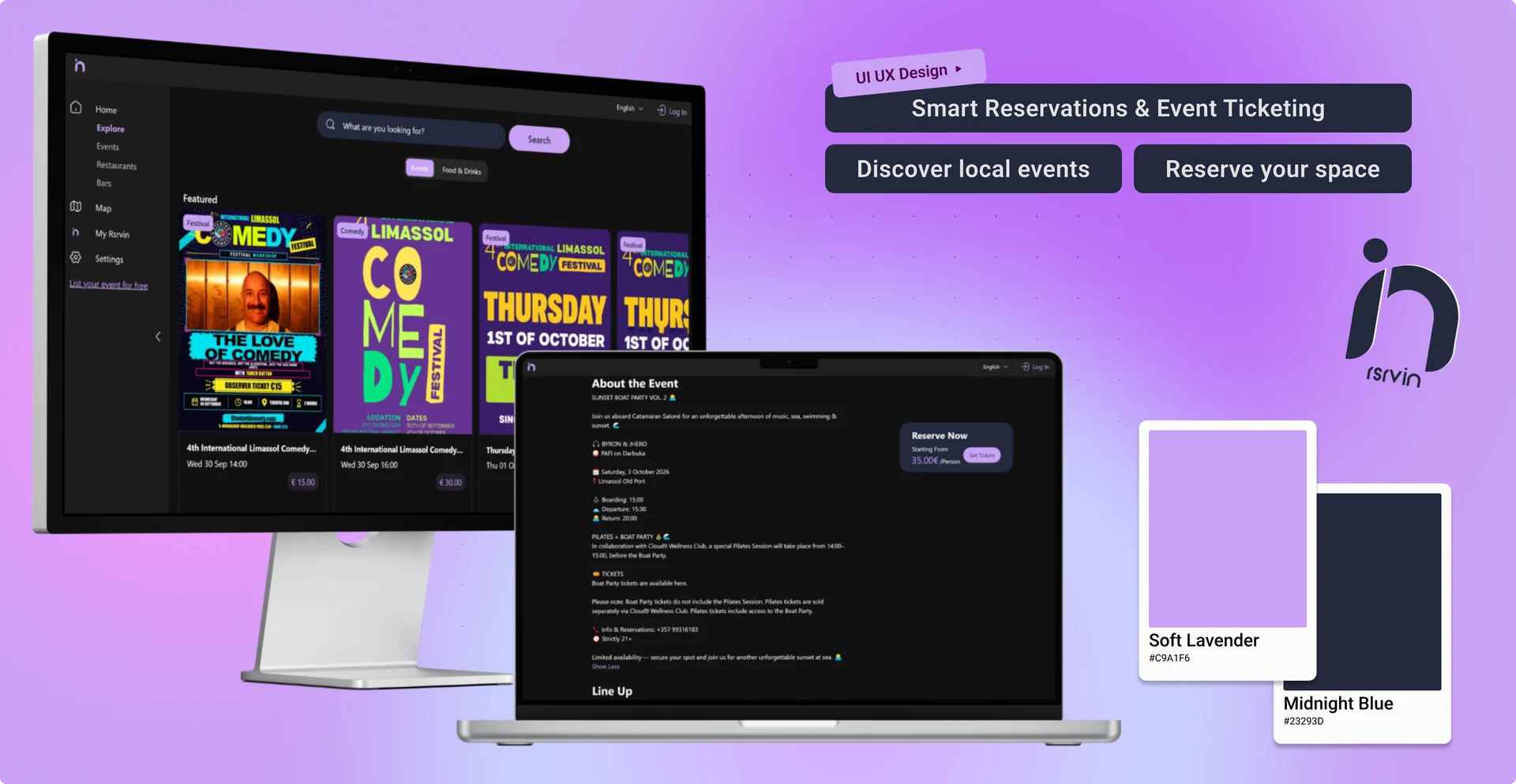
The design system for RsrvIn, a smart reservations and event ticketing platform where people discover local events and reserve their spot.
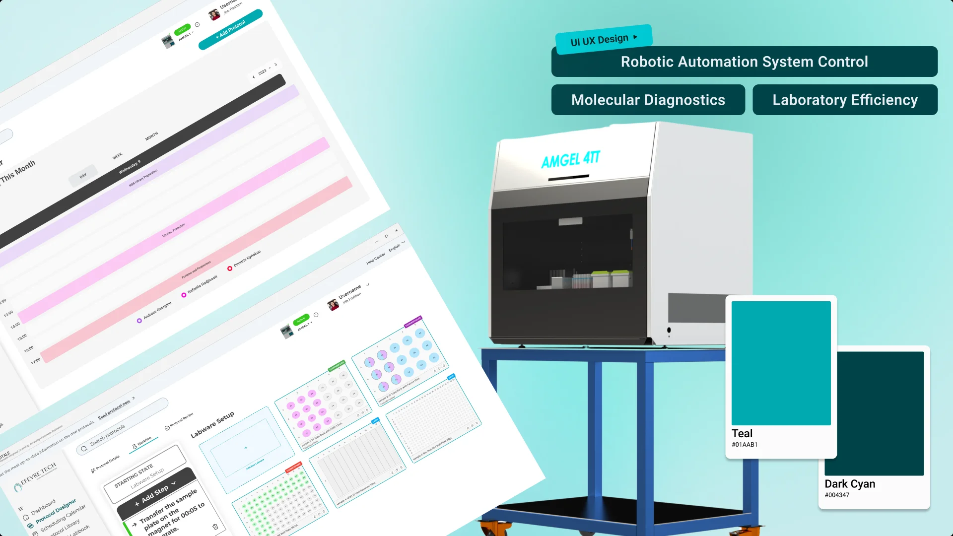
The design system for a technology transfer automation product, which helps move laboratory workflows from the research bench to automated systems.
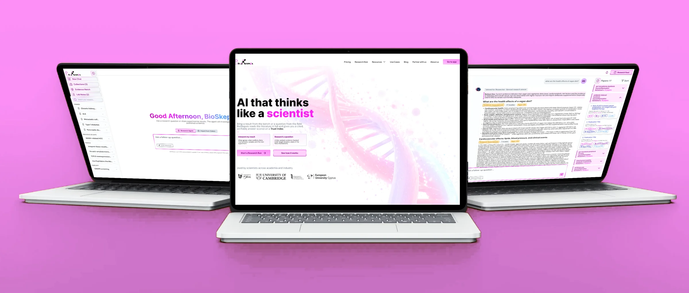
BioSkepsis AI is a software platform that helps life-science researchers. Bring a result from the laboratory bench or a question from the scientific field and BioSkepsis will read the full literature and give you a cited, verifiable answer scored on a Trust Index.
View Prototype
Life scientists are drowning in literature they can’t afford to ignore. Every result from the bench raises the same questions: does this fit what’s already published? Who has seen this before? What explains it if it doesn’t fit? Answering them means days of searching, reading full papers, and cross-checking findings by hand.
General-purpose AI tools promised a shortcut but didn’t earn researchers’ trust. They summarize instead of investigate. They still leave the searching to the user, they read abstracts rather than full methods, and they produce confident prose with citations that can’t always be checked. Some of those citations point to retracted papers, or to papers that don’t exist.
For scientists, an answer you can’t verify is worse than no answer. A wrong claim in a thesis, grant, or manuscript carries real professional cost.
So the challenge wasn’t just to build an AI that answers research questions. It was to design one researchers could audit: one that shows its work, shows where the evidence agrees and where it conflicts, and is honest about how much confidence each conclusion deserves.
Design challenge: How might we make AI-generated research answers as checkable as a colleague’s literature review, so scientists can trust them enough to act on them?
BioSkepsis is an agentic AI research assistant that works the way a careful scientist does. It investigates instead of summarizing, and every step it takes is visible and checkable.
The design rests on one principle: trust has to be shown, not claimed. Every part of the experience gives researchers a way to verify what the AI tells them.
Researchers arrive with one of two needs: a result from the bench they need to make sense of, or a question they want to explore. Many AI tools spread these across separate modes, tools and chat threads, which fragments the work. BioSkepsis keeps them in a single input. The agent recognises whether you’ve brought a result to interpret or a question to research, and shapes the output for that job: a verdict with next experiments, or a full evidence brief.
Researchers don’t start from zero, either. Importing a Zotero library brings their existing papers and past reading into BioSkepsis, so earlier work carries forward into every new run.
Before designing, I wanted to understand how researchers actually work with literature today, where existing AI tools fail them, and what would make them trust an AI answer enough to act on it. To validate my hypothesis, I explored existing AI tools that focus in the academic and scientific areas and interviewed active researchers.
I conducted more than 10 virtual interviews with researchers across academia and industry, from PhD students at UK universities to senior scientists at private research institutes. Using an affinity map, I grouped their feedback into five core insights.
To design a product that works for both the business and its users, I aligned the BioSkepsis team’s goals with what researchers told us they needed.
After defining the core user flows, I sketched key screens to map how researchers would move from a question or result to a verified answer. Because the outputs are dense with evidence, citations and scores, the priority was a clear hierarchy that keeps information readable without hiding detail. Researchers should be able to grasp the verdict at a glance, then dig into the evidence behind it.
From there, I moved to Figma, refining layout and hierarchy in mid-fidelity wireframes before adding BioSkepsis’s visual identity.

Mid-fidelity wireframes let me test structure and hierarchy before any visual styling. The focus was on three questions: how researchers start, how the evidence is laid out, and how work carries over between sessions.
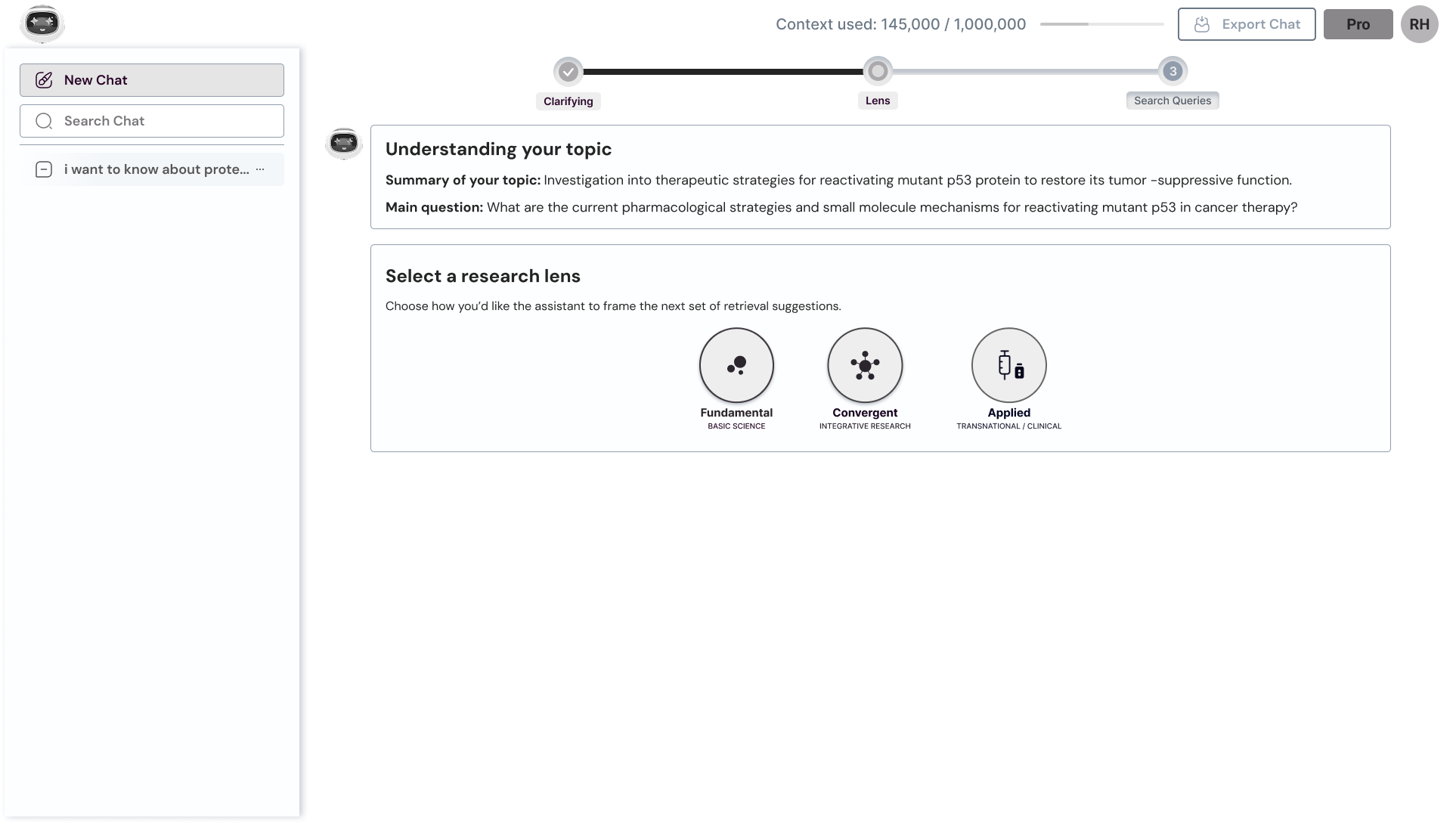
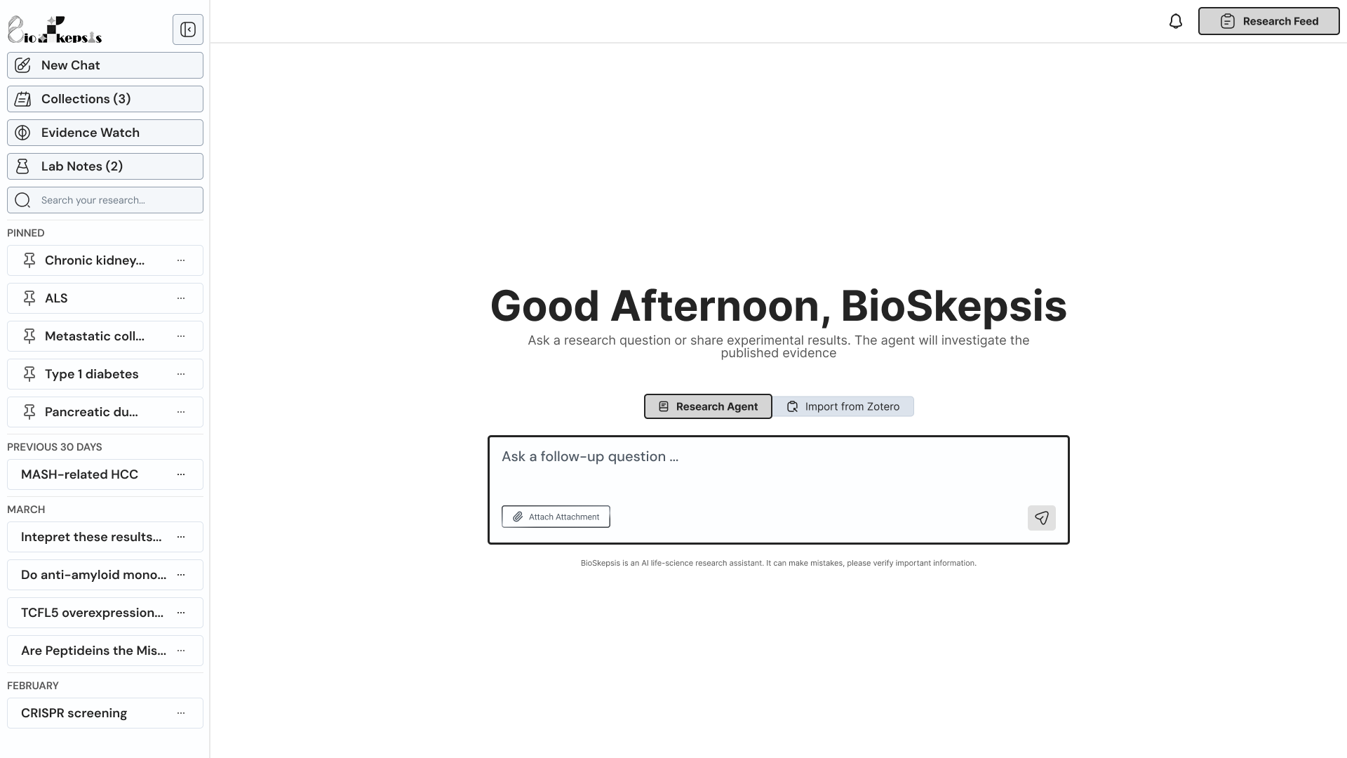
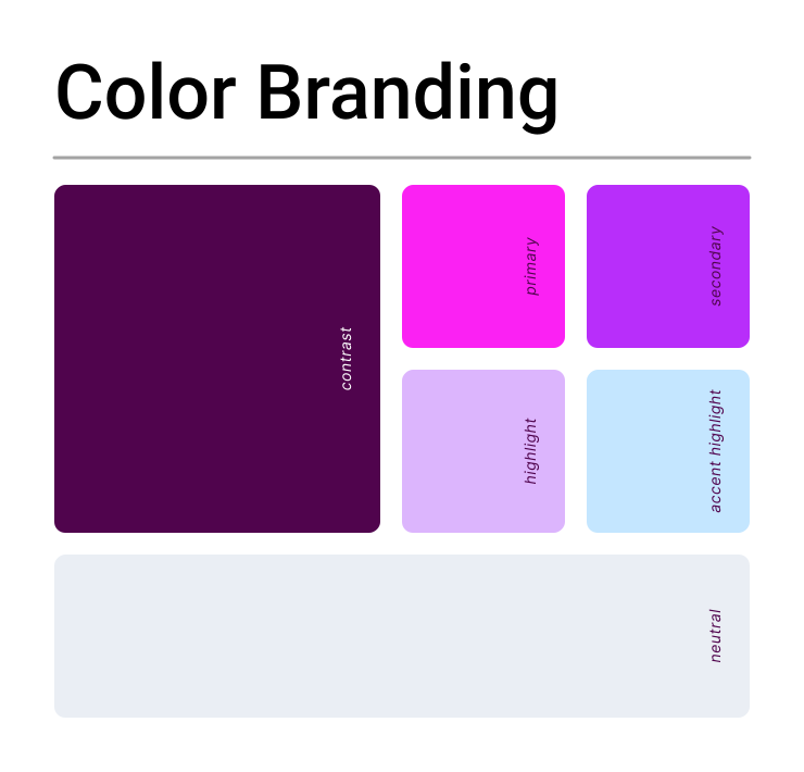
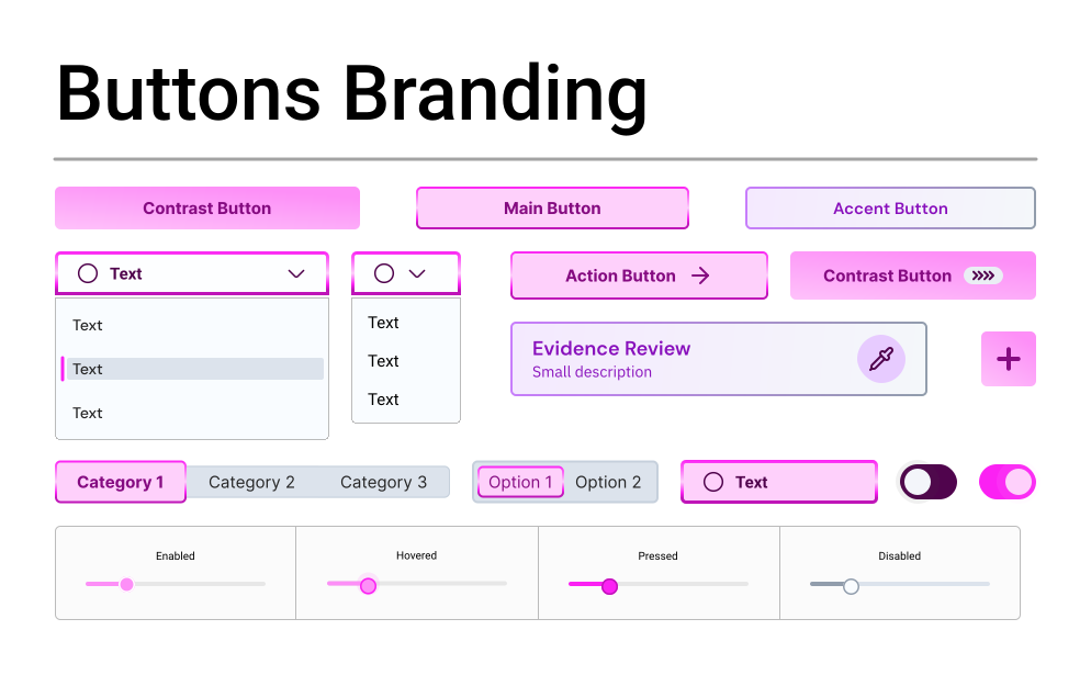
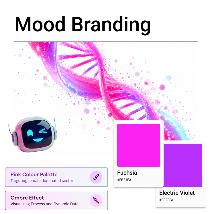
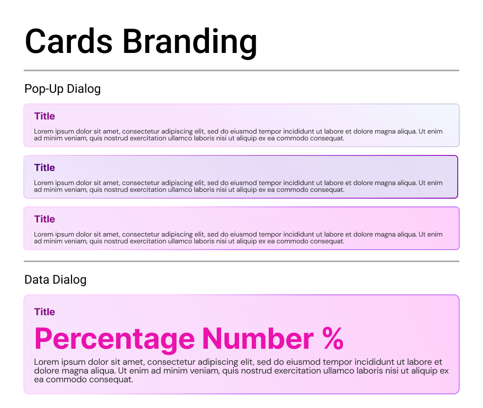
Every visual choice in BioSkepsis supports one goal: making dense scientific evidence feel clear, credible and approachable. Together, these choices keep the interface out of the way. The evidence is the hero; the design just makes it legible.
The wordmark combines “Bio”, from biology, and “Skepsis”, the Greek word for thinking, reflecting the product’s core idea: healthy scientific skepticism, powered by AI.
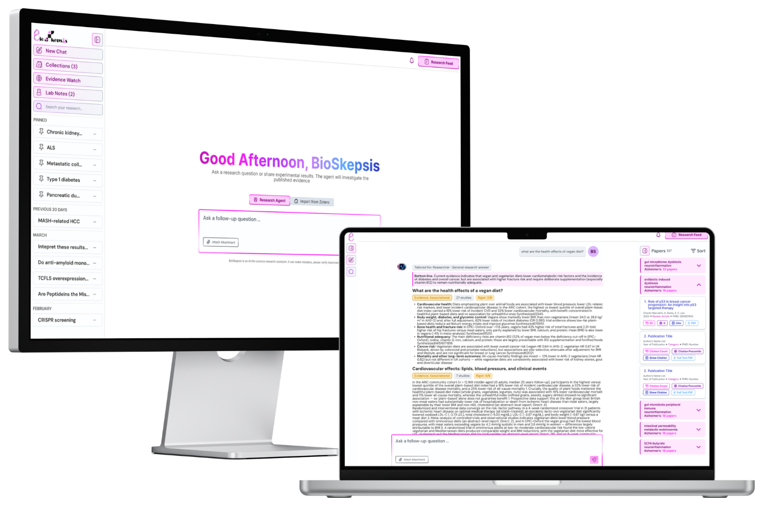
With an average satisfaction rating of 9/10, researchers found BioSkepsis especially valuable for life science literature review and result interpretation.
In feedback from over 30 early adopters, BioSkepsis received an average satisfaction rating of 9/10. Researchers highlighted its value for verifying findings, exploring a field in a structured way, and saving time on literature review. Today it is used by scientists at institutions including the University of Cambridge, King’s College London, IMBB-FORTH and the University of Cyprus, and it is available as a connector in Claude.
RsrvIn is a smart reservation and ticketing platform built for the people that want to spend less time reserving and more time partying. As a designer, I redesigned RsrvIn’s UI/UX.
Figma Design System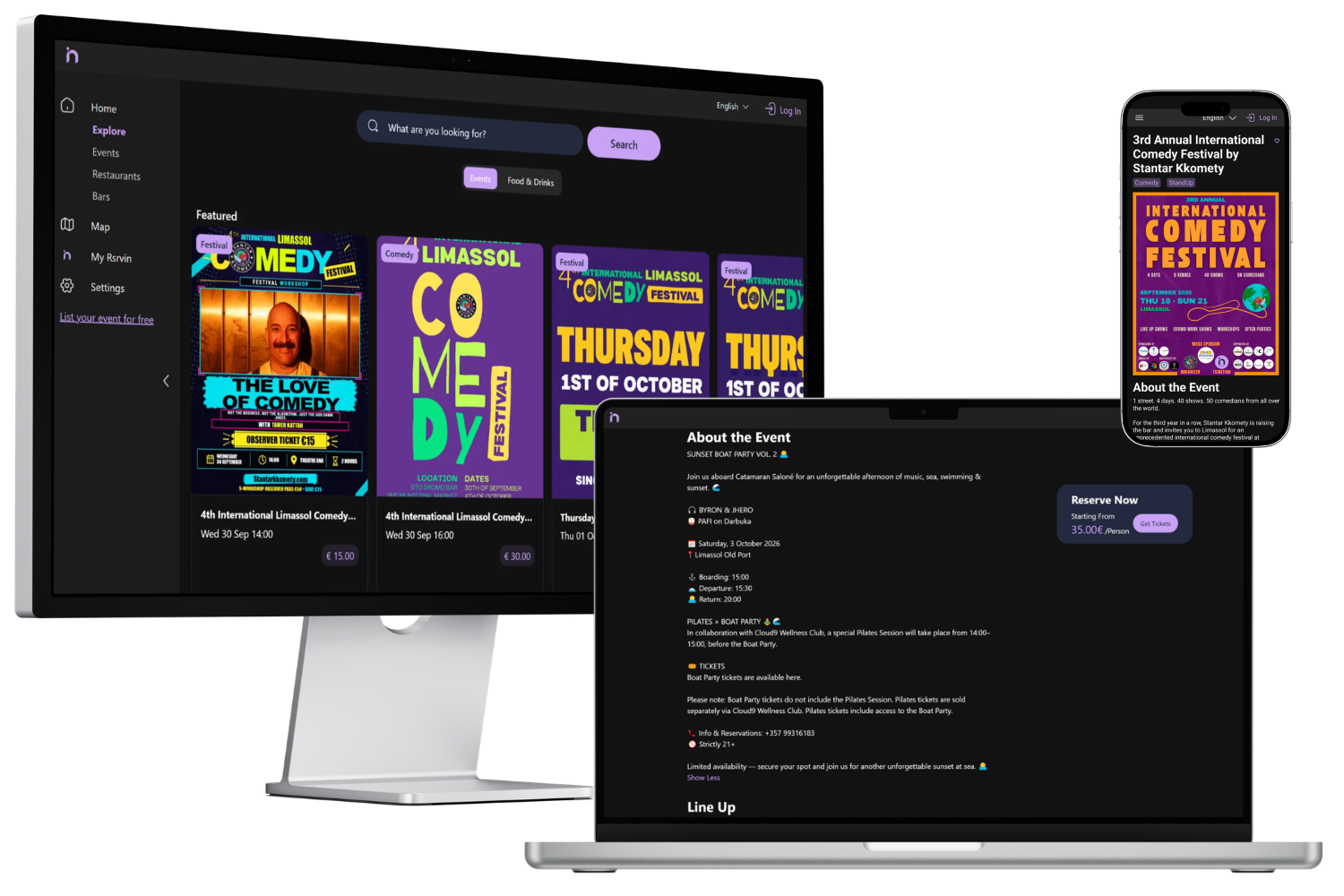
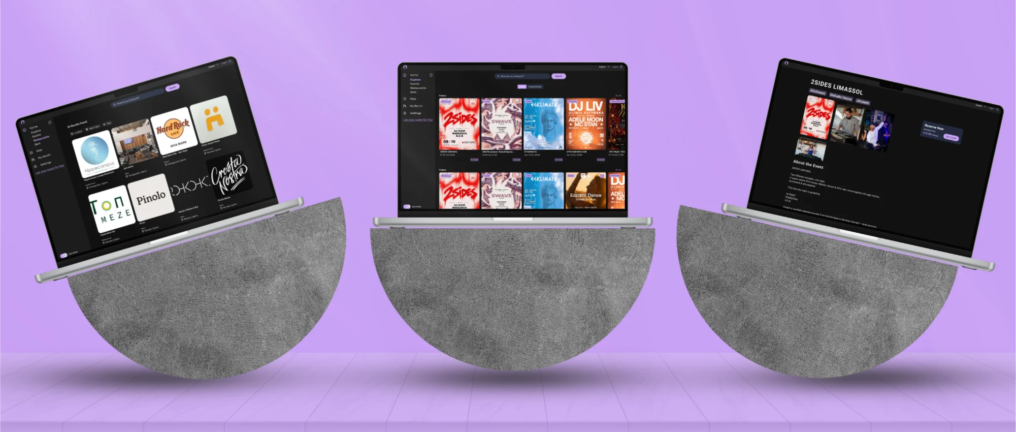
RsrvIn began as a reservation tool for venues, restaurants and bars. As the platform evolved, its focus shifted to event ticketing for Cyprus’ nightlife and comedy scenes, while still offering places to eat and drink before and after the show. Each pivot added new features, flows and screens on top of the original product, across web, iPhone and Android.
Built by a team consisting only of developers, the interface had no shared foundation. Colors, typography and components were defined screen by screen, so every new feature meant redesigning the basics and the experience drifted between platforms. Reservation-era screens and new ticketing flows didn’t feel like the same product. The brand also lacked the energy of the nights it was now selling. Going out is about excitement, and RsrvIn needed a bold, recognisable identity, especially in the dark mode where most nightlife browsing happens.
On top of that, every step from sign-up to buying a ticket or reserving a seat had to feel effortless and reliable. In a booking product, a confusing screen or an unfamiliar-looking checkout is enough to lose a sale.
Design challenge: How might we build one design system that unifies RsrvIn’s evolving product under a bold, consistent identity across web, iOS and Android, so discovering and booking a night out feels effortless on any device?
RsrvIn’s design system is a single source of truth in Figma. Shared colors, typography, components and layouts make every screen look and behave the same, whether someone is browsing events on desktop or booking a seat on their phone.
The system rests on one principle: consistency should feel effortless, not restrictive. Every part of it helps the team move fast while keeping RsrvIn instantly recognisable.
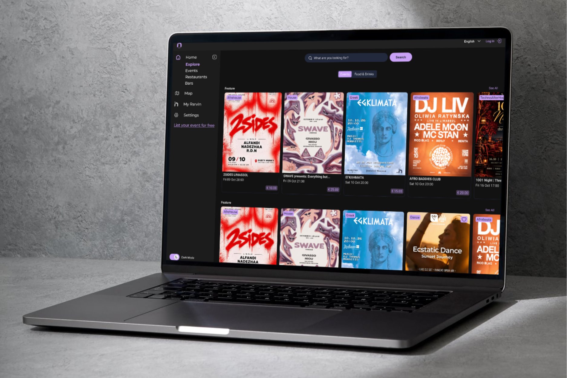
On desktop, Explore combines search, filters and a map with poster-led event cards that let each event’s artwork sell the night. Event pages keep a clear “Reserve now” card in view, so booking is always one step away.
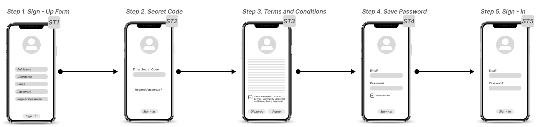
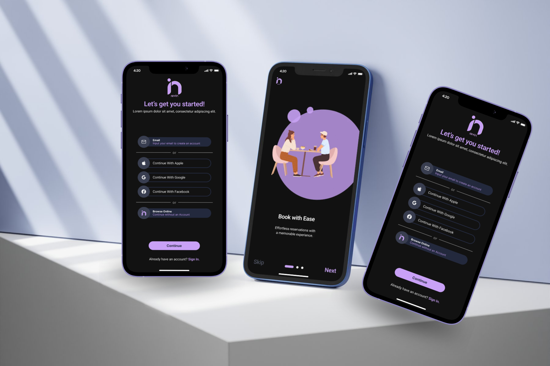
On iPhone, a short three-step onboarding (Book with Ease, AI-Powered Exploration, Choose Your Perfect Seat) leads straight into sign-up and the home feed, with as little friction as possible between download and first booking.
The founding team led the market research: who RsrvIn’s customers were, which scenes to focus on, and how the business would grow. My focus was the design side. I needed to understand what the product needed visually, how competitors presented going out, and what a brand for Cyprus’ nightlife should feel like.
To build a design system that served both the business and its users, I aligned the founding team’s goals with the needs of RsrvIn’s two audiences: the fans who buy tickets, and the organizers and venues who sell them.
After defining the core user flows, I sketched key screens to map how people would move from browsing to a confirmed booking, on desktop and on mobile. Because event discovery is driven by artwork, dates and venues, the priority was a clear hierarchy that lets each event’s poster stand out without the interface competing for attention. Users should be able to spot something worth going to at a glance, then book it in just a few taps.
From there, I moved to Figma, refining layout and hierarchy in mid-fidelity wireframes before applying the RsrvIn design system: its colors, typography and components.
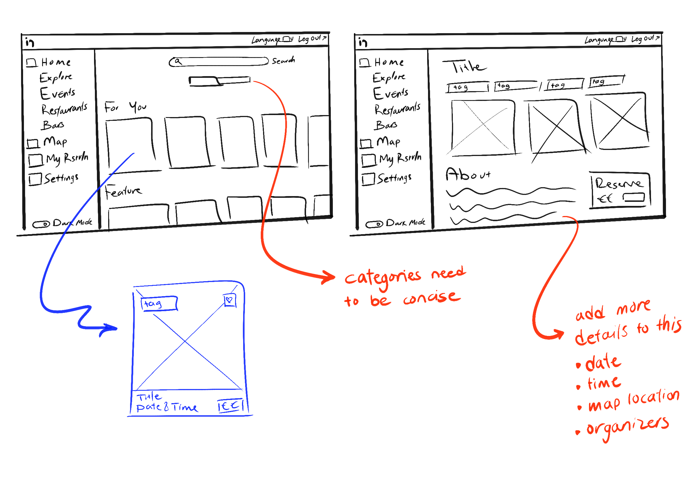
Mid-fidelity wireframes let me test structure and hierarchy before applying the design system. The focus was on three questions: how people discover what’s on, how an event page leads to booking, and how new users get from download to their first ticket.
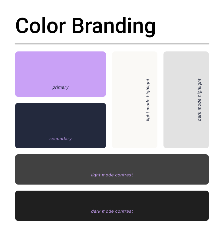
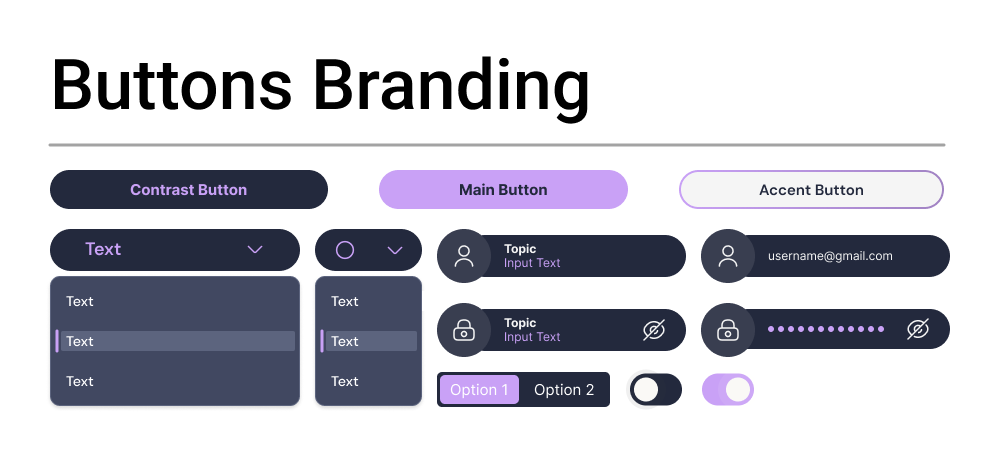
Every visual choice in RsrvIn supports one goal: making going out feel exciting and booking it feel effortless. Together, these choices keep the interface out of the way. The events are the hero; the design just gets people through the door.
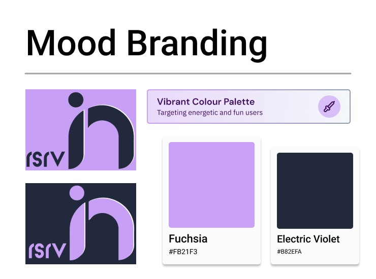
The RsrvIn mark turns the “in” of the name into a bold monogram, a simple, confident shape that works as both a logo and a favicon. The brand name selection combines “Rsrv”, short for reserve, and “In”, as in reserving in your ticket or booking, reflecting the product’s core idea: from finding a night out to walking through the door, in just a few taps.
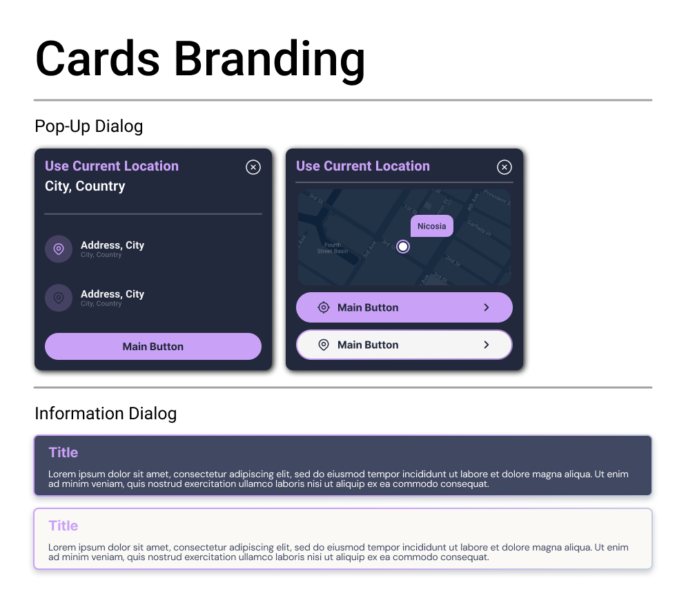
With the design system in place, I designed a new marketing website for RsrvIn. Its job was to explain what RsrvIn offers at first glance and turn visitors into ticket buyers and organizers. The site went through several rounds of iteration, shaped by feedback from the founding team and early users, until every page felt clear, on-brand and ready to sell a night out.
Interactive prototype: scroll and click inside the screen, or open it full screen ↗
On iPhone, the design system came together in a fast, focused experience built for booking on the go. A short three-step onboarding introduces what RsrvIn does, which is Book with Ease, AI-Powered Exploration, and Complete Your Ticketing Reservation, then leads straight into sign-up, account creation and email verification. From there, users land in a home feed of events they can browse and book in a few taps, all in a dark interface designed for late-night browsing.
On desktop, the redesigned web app brings events, venues and bars together in one consistent Explore experience. Search, filters and a map help people find what’s on, while poster-led cards let each event’s artwork do the selling. Event pages keep a clear “Reserve now” card in view, so the path from discovery to booking is always one step away. Reservation-era screens and new ticketing flows now look and behave like one product.
The design system for a technology transfer automation product, which helps move laboratory workflows from the research bench to automated systems.
View Prototype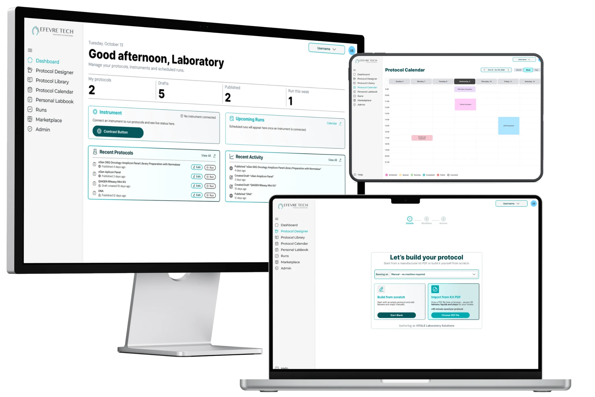
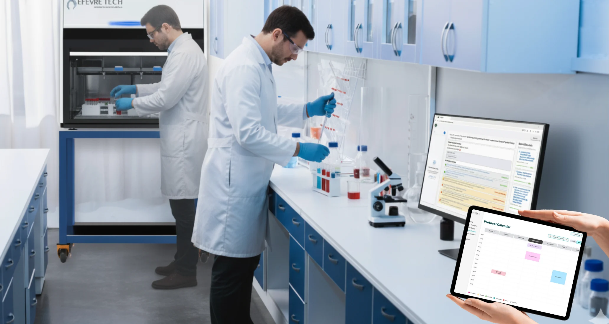
Life science laboratories run on repetitive, high-precision work. Researchers spend hours on sample preparation and liquid handling, track experiments across notebooks and spreadsheets, and juggle shared instruments with no clear schedule. Every manual step is a chance for error, and every scattered record makes results harder to find, reproduce and share. This phenomenon is known as the irreproducibility crisis.
EFEVRE TECH’s AMGEL laboratory robots can automate this work, but they need a control software that researchers without a robotics or programming background could actually use on a daily basis. VITALE comes from Versatile Integrated Technology Advancing Life-Science Exploration. VITALE is specifically engineered to address these challenges by offering an all-in-one solution for laboratory automation and data management. Whether it’s automating routine tasks, ensuring handling of samples, or providing real-time insights into ongoing experiments, VITALE empowers researchers to focus on what truly matters: groundbreaking discoveries.
Building it meant bringing together very different worlds. Robotics engineers, mechanical engineers, software developers, product designers, UI/UX designers and life-science researchers each spoke a different work-language and had different priorities. Hardware and software had to be developed in step, so a change on one side often meant rework on the other. And because the software controls physical instruments handling real samples, precision and reliability couldn’t be compromised.
As project coordinator, my job was to align these teams, keep hardware and software moving together, and make sure VITALE solved the problems researchers face at the bench.
Coordination challenge: How might we bring robotics engineers, developers and scientists together to build a laboratory automation control software that researchers can trust with their experiments, without needing to be automation experts?
VITALE is an all-in-one laboratory automation platform. Researchers design protocols, schedule runs, monitor experiments and record results in a single piece of software that controls robotic laboratory equipment, so they can spend less time pipetting and more time on discovery.
The project rested on one principle: automation should give scientists more control, not less. With just 12 months to deliver, every feature had to earn its place by solving a real problem at the bench.
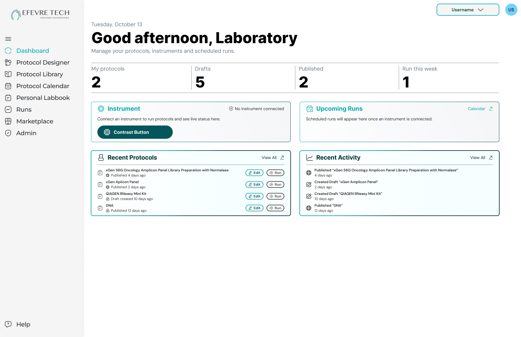
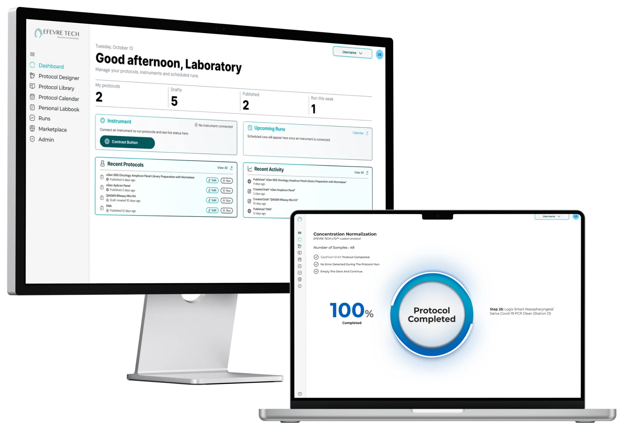
The Dashboard brings scheduled protocols, active tasks, user actions and AI-driven alerts into one view. Researchers can see what’s running, what’s next and what needs attention at a glance, which improves coordination across the whole laboratory.
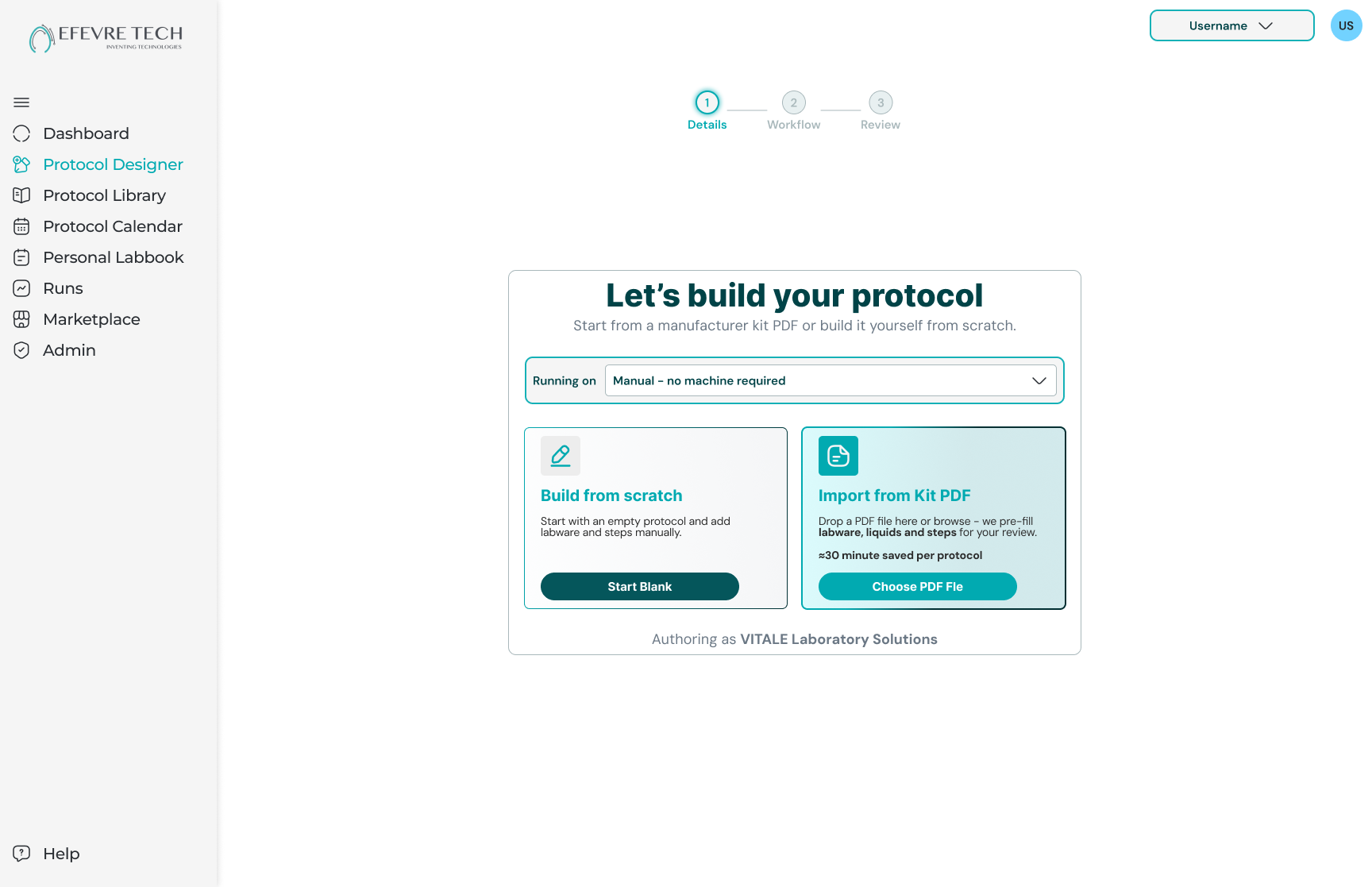
The Protocol Designer lets researchers build custom workflows visually, setting up labware and fine-tuning parameters like liquid transfer volumes without writing code. Scientists get full control over every step, without needing a programming background or specialist support.
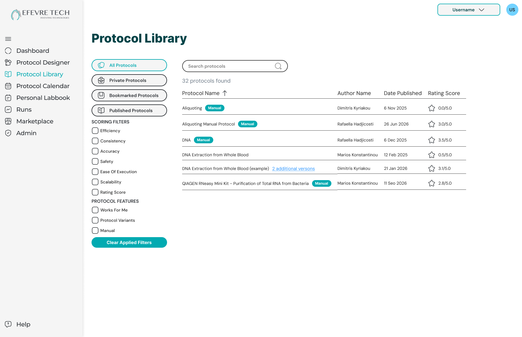
Every protocol created in the Protocol Designer is saved automatically to the Protocol Library, building up a collection of tested workflows the whole laboratory can draw on. Researchers can find, reuse and adapt existing protocols instead of rebuilding them from scratch, which saves time and keeps experiments consistent from one run to the next.
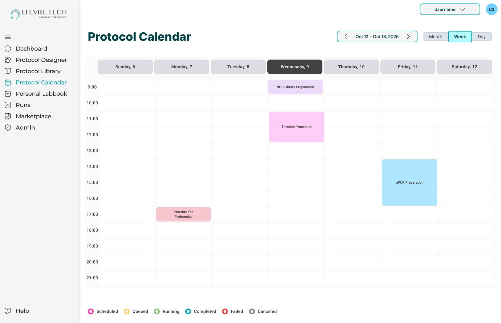
The Scheduling Calendar lets researchers book protocol runs 24/7, with color coding for each researcher and real-time notifications. Shared instruments stop being a source of conflict, and robots can keep working overnight while the team is away.
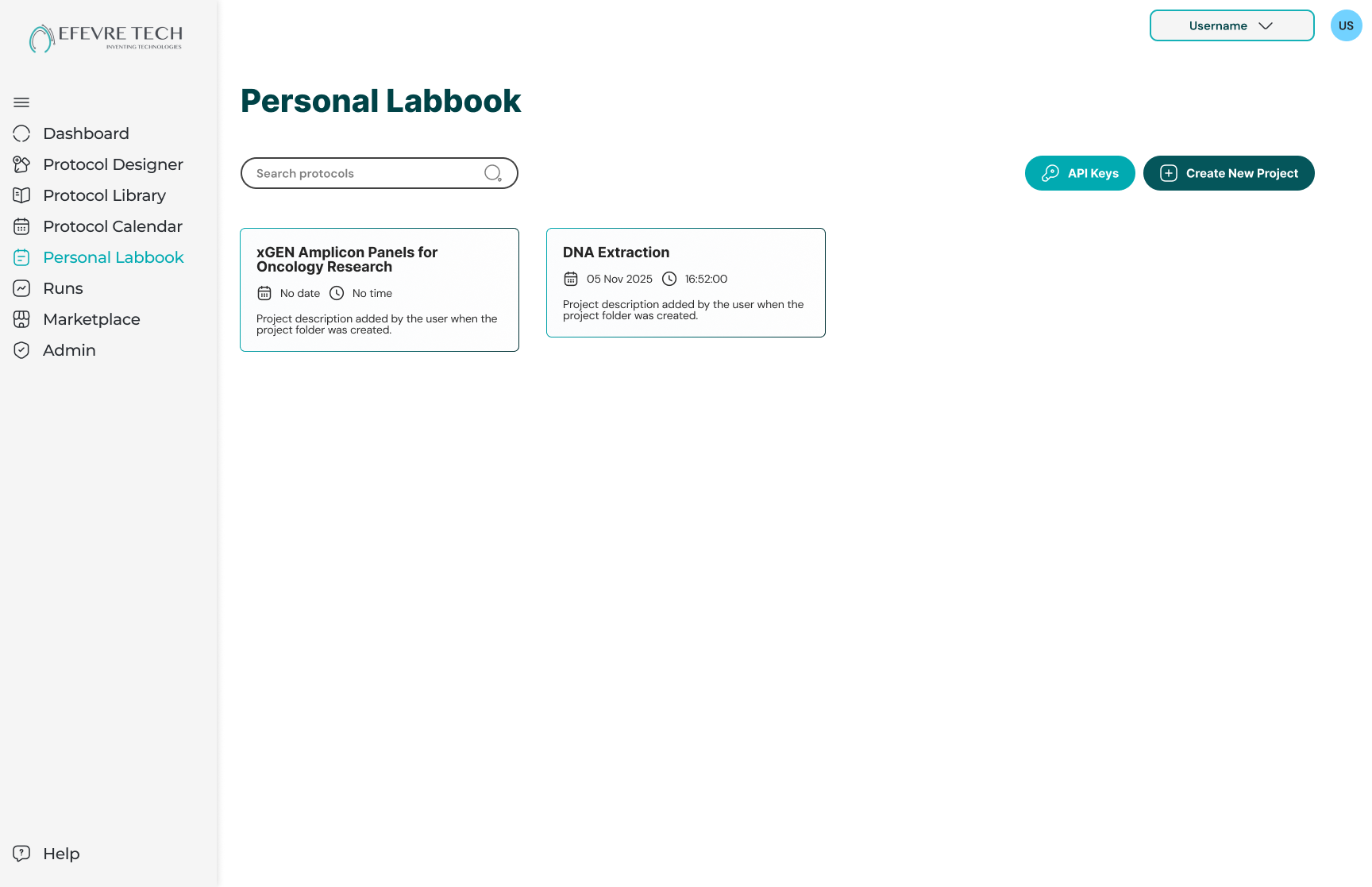
The Personal Labbook collects data from every experiment into searchable, always up-to-date records. Researchers can find past results in seconds and share selected entries with their team, using templates that adapt to their research.
Delivering a hardware-integrated platform in 12 months meant robotics, software and research teams couldn’t work in sequence; they had to move in parallel. As project coordinator, I broke the year into clear milestones, kept hardware and software deliverables aligned, ran regular cross-team reviews, and gathered researcher feedback on each module. This kept everyone working toward the same priorities and turned a tight timeline into a focused one.
The result: a laboratory automation platform that reduces manual errors, keeps the laboratory running around the clock, and puts every protocol and result in one place, delivered within 12 months by a team that stayed aligned across hardware, software and science.
Before building VITALE, we needed to understand how researchers run their experiments today, what holds them back, and what they’d expect from automation software. I led a mix of quantitative and qualitative research to hear from as many scientists as possible.
To understand where VITALE could stand out, I reviewed three leading laboratory automation tools: Opentrons Protocol Designer, Waters OneLab and Biosero Green Button Go. Each solves an important part of the automation puzzle, from no-code protocol design to traceable run records and round-the-clock scheduling. But none brings the full workflow together. Protocol tools are tied to their own manufacturer’s robots, scheduling suites are built for large, complex facilities, and researchers are left moving between separate systems to design, schedule and document their work. The SWOT below maps these strengths and gaps, and the opportunities they opened for VITALE.
To move beyond survey answers, we held one-to-one online meetings with research groups at universities and institutes. Each session mapped a team’s workflow end to end, from planning an experiment and preparing samples to running protocols, recording results and sharing them with colleagues. We noted where time was lost, where errors crept in, and where researchers relied on workarounds.
Several teams already used competing automation or laboratory management tools, which made these meetings especially valuable. Instead of asking what researchers might want, we could compare what existing tools did well against where they fell short in real use. Patterns that appeared across several groups, rather than one-off requests, became the needs VITALE was designed around.
Across meetings, questionnaires and demos, one pattern kept coming up: researchers weren’t short of automation tools, they were short of tools that fit how they actually work. Most wanted to design their own protocols but didn’t code. The most time-consuming tasks were also the most error-prone. Shared instruments caused constant scheduling friction, and results ended up scattered across robot software, notebooks and spreadsheets. Because laboratories mix equipment from different manufacturers, they needed one flexible system rather than another tool tied to a single brand.
I brought together everything we heard, from 50 questionnaire responses, one-to-one meetings with research groups, and feedback from live demos at events like GITEX, and grouped it on an affinity map. Five clear themes emerged, and each one became a building block of VITALE.
How might we give researchers full control over automated experiments, from designing a protocol to recording its results, without needing to write code or switch between tools?
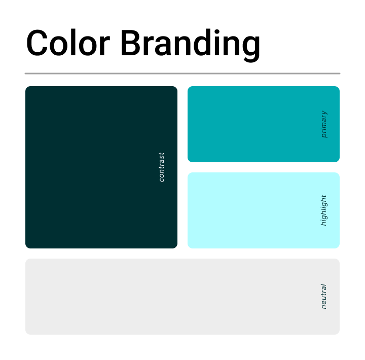
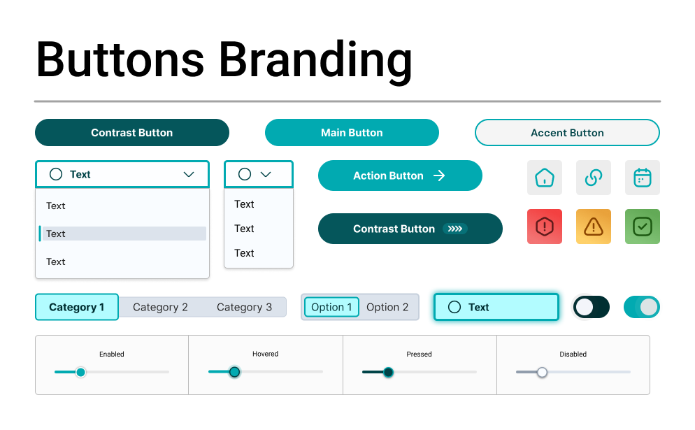
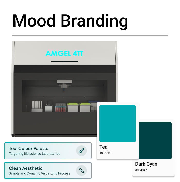
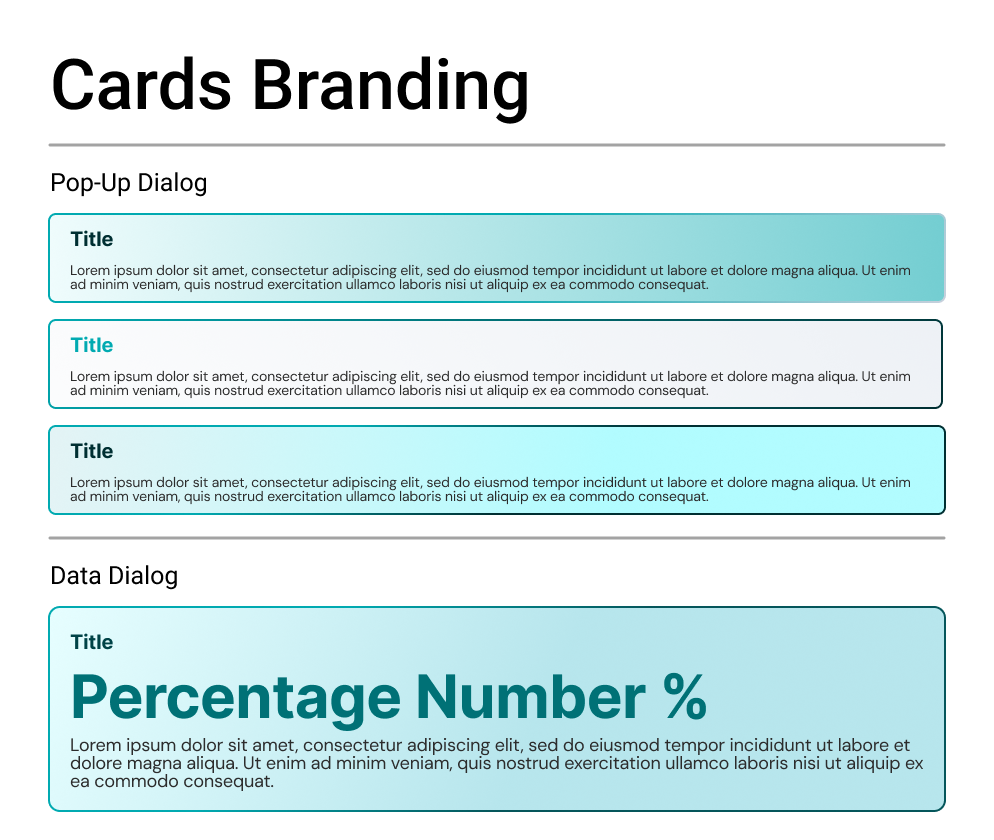
Every visual choice in VITALE supports one goal: making complex laboratory automation feel clear, controlled and trustworthy. Together, these choices keep the interface out of the way. The science is the hero; the design just keeps the laboratory running smoothly.
The name VITALE stands for Versatile Integrated Technology Advancing Life-Science Exploration, reflecting the product’s core idea: one integrated platform that gives scientists the freedom to automate their own research.
Delivered in 12 months, VITALE brought laboratory automation within reach of researchers without coding skills, and drew international interest from day one.
Funded by the European Union through Cyprus’ Research and Innovation Foundation, VITALE was delivered within its 12-month timeline as an integrated platform for designing, scheduling, monitoring and recording automated experiments. At GITEX Global 2024 in Dubai, it led to strategic meetings with the Technology Innovation Institute, Saudi German Hospital, Middlesex University Dubai and Dubai Municipality’s Agricultural Division, with interest in bringing VITALE and the AMGEL robots into their laboratories. Researchers singled out the Protocol Designer for making automation accessible, and their feedback on hardware flexibility and regional compliance shaped the next phase of development.
Industrial Product Designer & UI/UX Designer
Industrial product designer and UI/UX designer who blends design craft, marketing insight and digital skills. Experienced in taking ideas from concept and 3D model to working prototype, designing intuitive interfaces, and creating promotional material, with experience coordinating projects across cross-functional teams.
EFEVRE TECH LTD·Full-time
A&S Kourounas Jewellery·Internship
GC School of Careers·Part-time
ENGINO·Internship
De Montfort University
Let's put an image to your vision and create your next project together. Share your ideas with me and let's get cracking on some designs.
 Elicit
 Consensus
 Opentrons Designer
 Waters OneLab
 Biosero Green Button Go